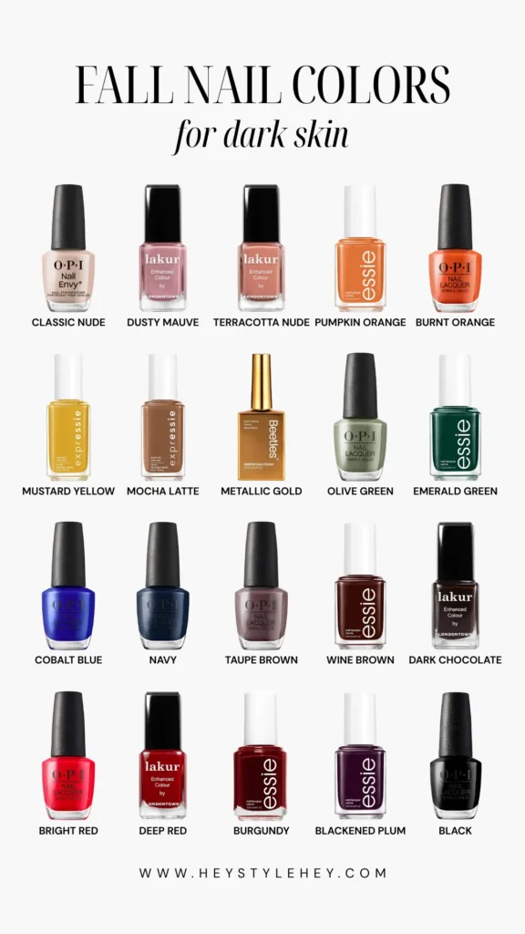
Fall nail colors for dark skin are honestly my favorite roundup to put together every year, and here’s why: the color range is just bigger.
Deeper skin tones can carry saturation that would wash someone out somewhere lighter, and pull off darks that’d look flat on paler hands.
So this list gets to be way more interesting than “here, have ten shades of brown.”
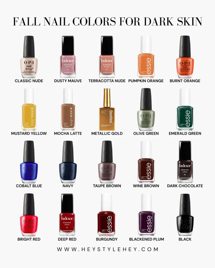
Twenty made the cut this time. Starting quiet, ending loud.
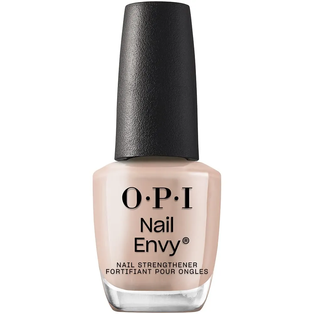
1. Classic Nude
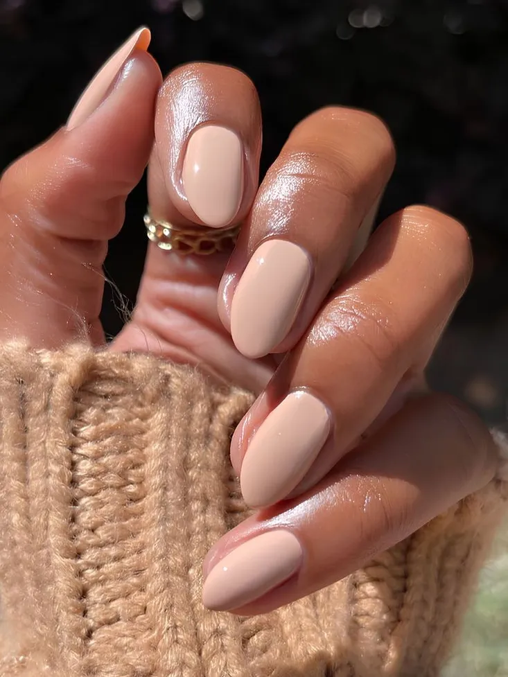
Okay first thing. Skip the cool pink-beige nude entirely.
What actually works is warmth in the base. Something caramel-leaning. It should sit close enough to your natural nail bed to look intentional, not like you forgot to finish your manicure.
And go glossy, not matte. Matte kills whatever warmth the shade had going for it.
This is the one manicurists reach for the second someone says “make it look clean, no fuss.” No further conversation needed.
Bonus: it’s the most forgiving option if your nails are short, since there’s no length-illusion trick you need to pull off.
RECREATE THE LOOK
2. Mustard yellow
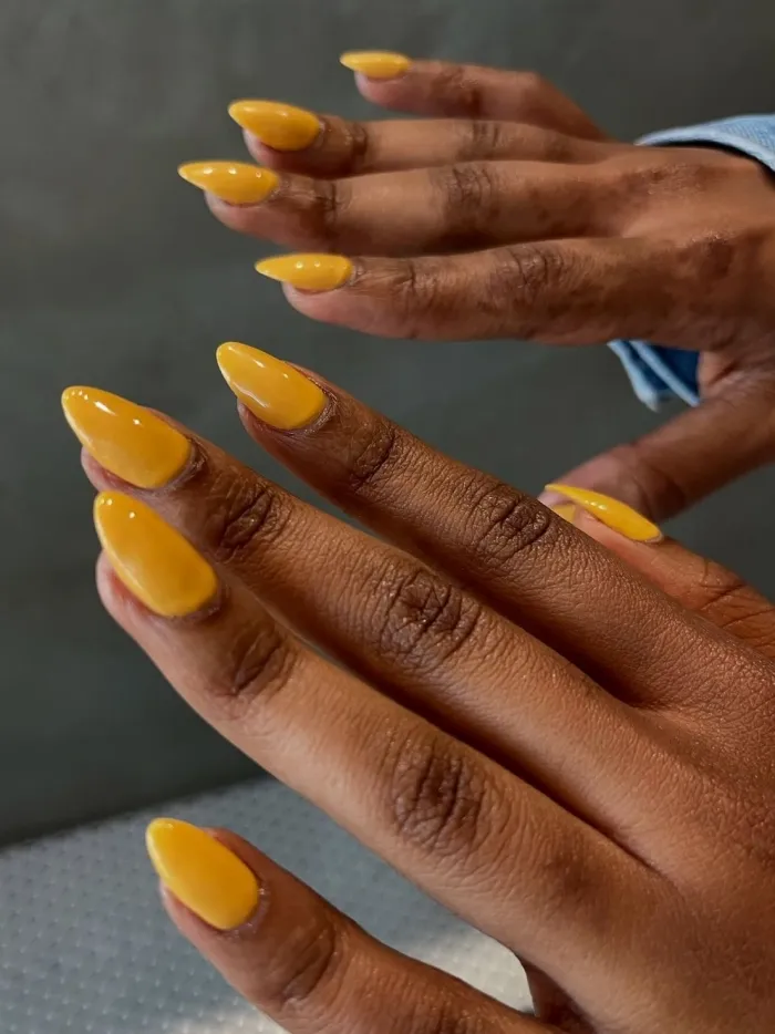
I get why yellow nails scare people.
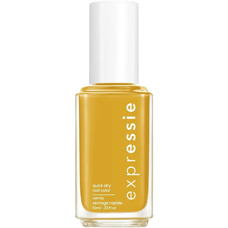
But mustard is different. Specifically the dusty, almost antique version, not anything bright or lemony. It reads grounded instead of jarring, warm instead of sickly.
Best on medium to long almond or oval nails, just fair warning. On very short square nails it can end up looking more like a paint swatch than a manicure.
Pair it with denim, camel coats, gold jewelry, and the outfit’s basically sorted.
RECREATE THE LOOK
3. Mocha latte
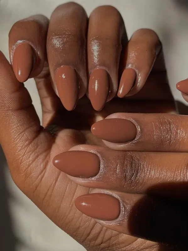
This one lives somewhere between nude and full brown, and that in-between thing is exactly the appeal. It’s not trying to make a statement.
Think the polish version of a good neutral sweater. The kind you throw on without thinking and it works.
On deeper skin it pulls warmer than it looks sitting in the bottle, which is the best kind of surprise.
People request this one on repeat through the early fall months, October and November especially, then it tapers off a bit once actual winter hits.
Go velvet or soft-matte here rather than high shine. It softens the brown instead of flattening it out.
RECREATE THE LOOK
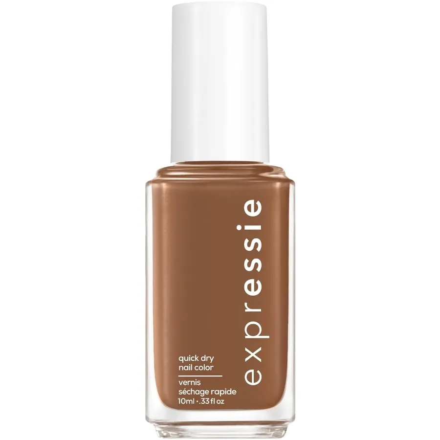
4. Burgundy or oxblood
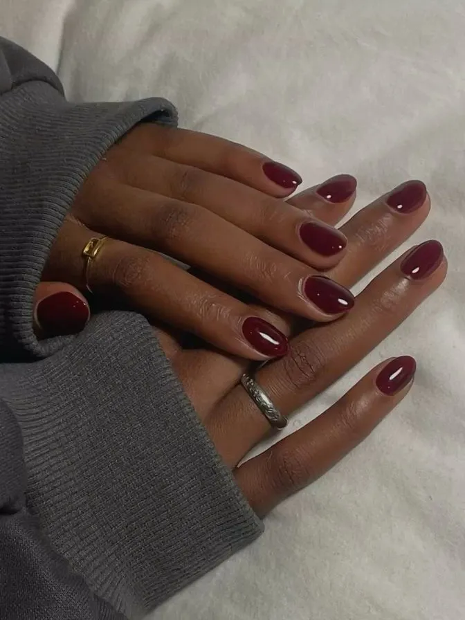
If I had to pick one shade to recommend blind, it’d be this.
Nail artists say the same thing constantly. Burgundy is basically the safest nail color there is for deep skin tones.
Oxblood specifically. Barely any pink in it, mostly depth and a whisper of brown underneath.
Think of it as the nail version of a really good winter coat. People wear some version of this from September clear through February and never bother switching. I don’t blame them.
RECREATE THE LOOK
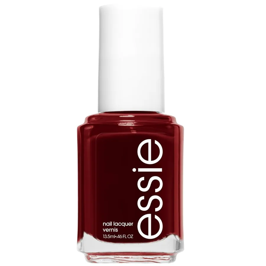
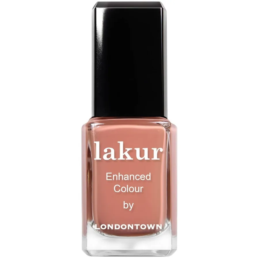
5. Terracotta nude
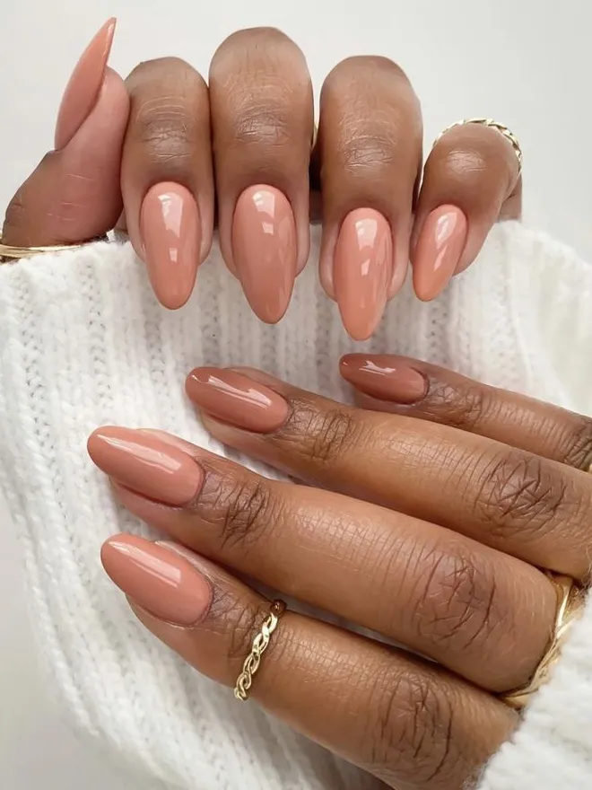
Okay, this is the nude I’d actually pick over classic nude most weeks. Same idea, pushed further toward clay, a little more sun-baked.
People ask for this one specifically now, more than the plain version. It’s got more personality without tipping into “look at my nails” territory.
Glossy finish, same rule as before. On oval or almond shapes it reads almost like bare nails that happen to catch light better than usual.
RECREATE THE LOOK
6. Cobalt blue
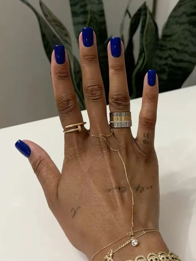
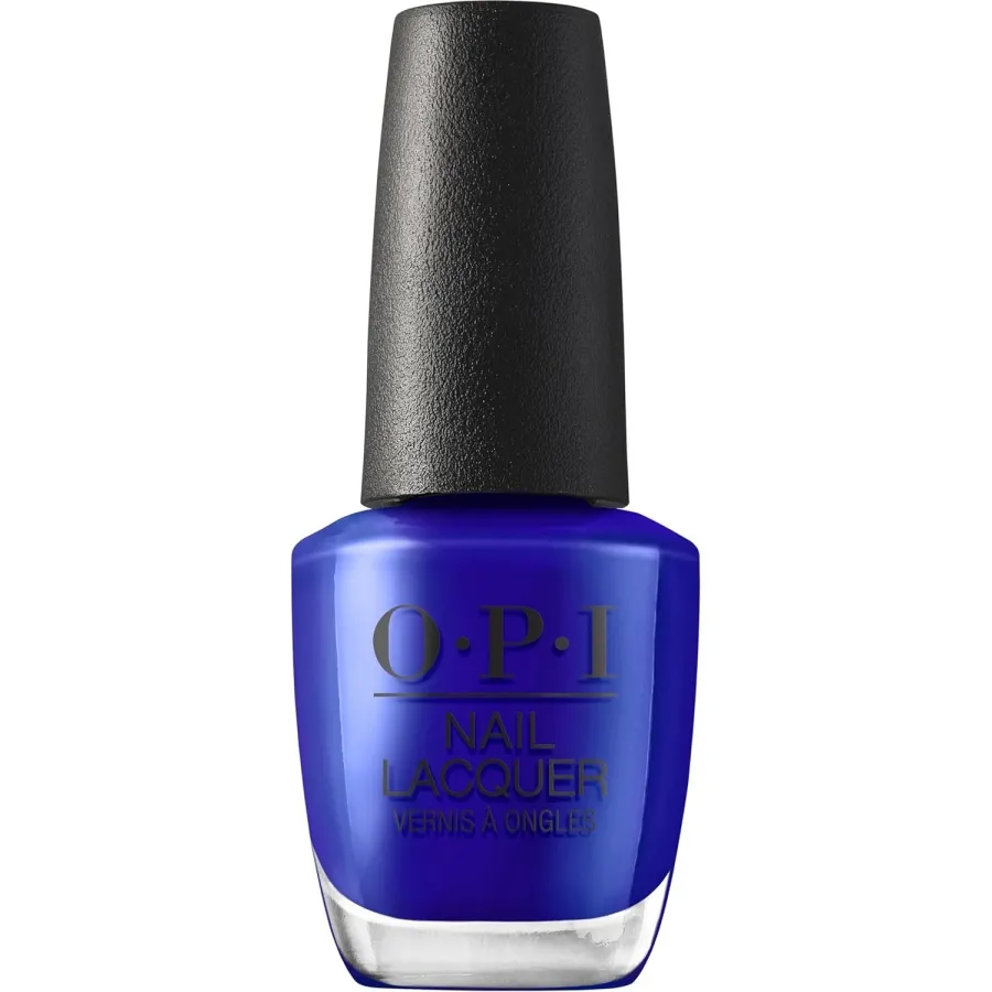
If navy is the safe choice, cobalt is the “actually, notice my hands” choice. Brighter, more saturated, way closer to a jewel tone than anything you’d call a neutral.
I wouldn’t try this on every skin tone. A blue this intense can tip straight into costume territory. But deep skin tones handle it without any of that.
Keep it glossy, almond or round nails, and it stays feeling like a manicure.
RECREATE THE LOOK
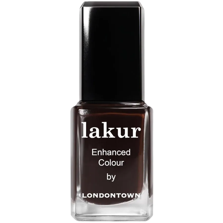
7. Dark chocolate
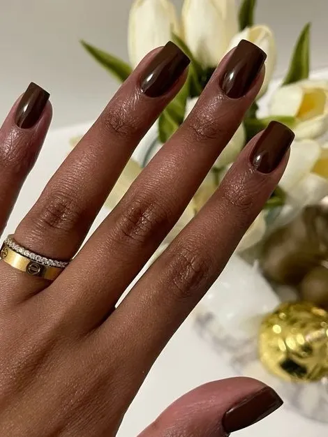
Black gets all the credit for looking “serious,” but dark chocolate pulls it off equally well, minus the starkness. A good version has real density to it, almost matte-looking even with gloss on top.
That’s the whole appeal to me. It looks like it costs way more than it actually does.
It’s also one of the few browns that photographs true to the bottle no matter the lighting. Lighter browns shift warm or gray depending on the room. This one doesn’t.
RECREATE THE LOOK
8. Bright red
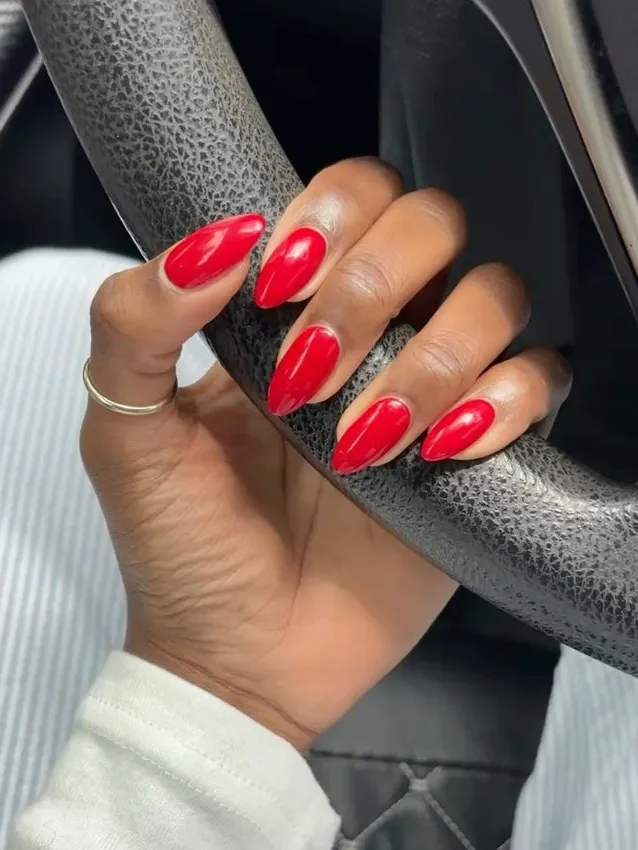
Everyone treats red like the boring safe choice, the one you grab when you can’t decide on anything else.
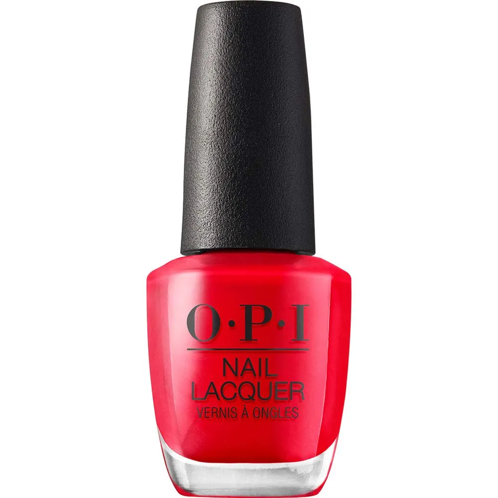
But a truly bright red, not brick, not berry-toned, plain red, might be the single most versatile shade here.
Glossy, always, no exceptions from me.
Chrome or metallic red tends to fight with deeper skin rather than flatter it. It goes cool, weirdly purplish under certain lights.
Keep it high shine and simple, and this works equally well in July and December.
RECREATE THE LOOK
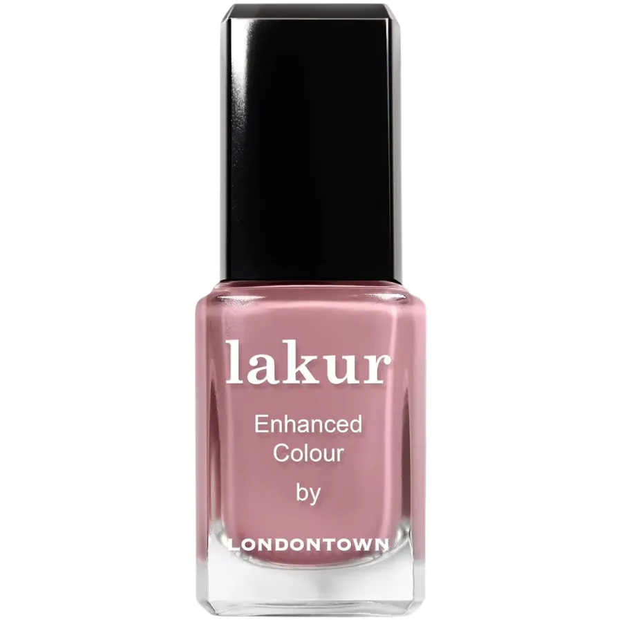
9. Dusty mauve
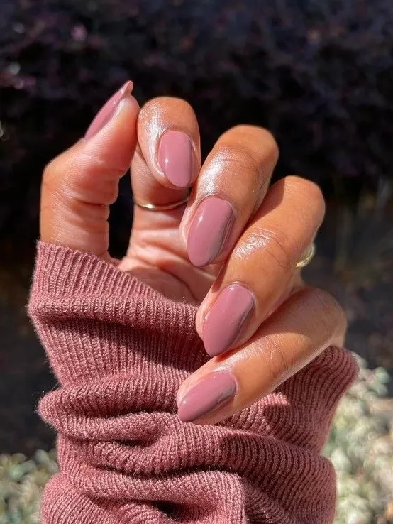
This is the shade for someone who says they don’t want anything “too much.”
Somewhere between rose and taupe, dusty mauve doesn’t fully commit to being either, and that ambiguity is what makes it interesting.
It leans cooler than most of the shades here, which is a relief after so many warm, earthy tones stacked next to each other.
Soft-matte suits it best. Gloss pushes it too close to plain pink, and that undoes the whole point of picking it in the first place.
RECREATE THE LOOK
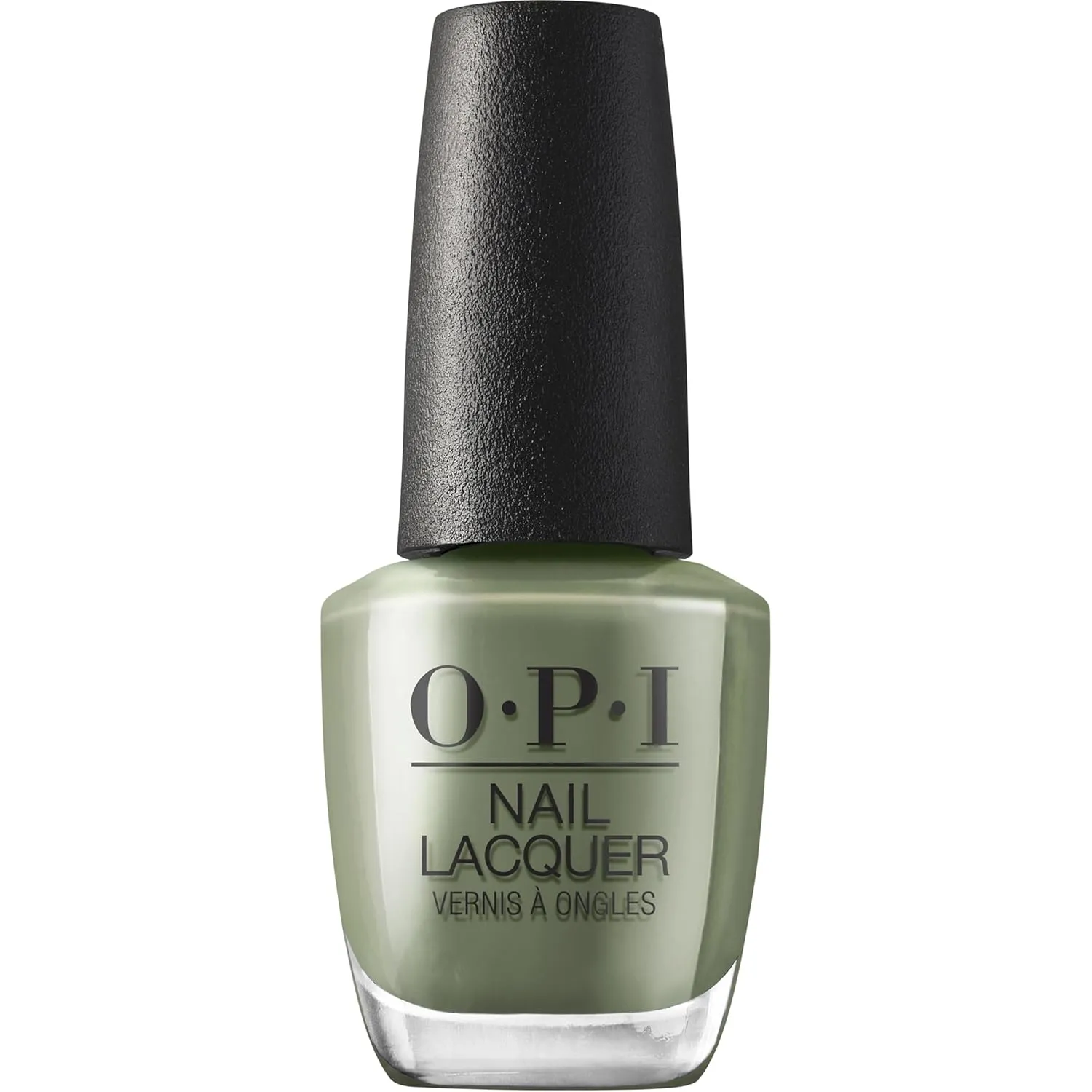
10. Olive green
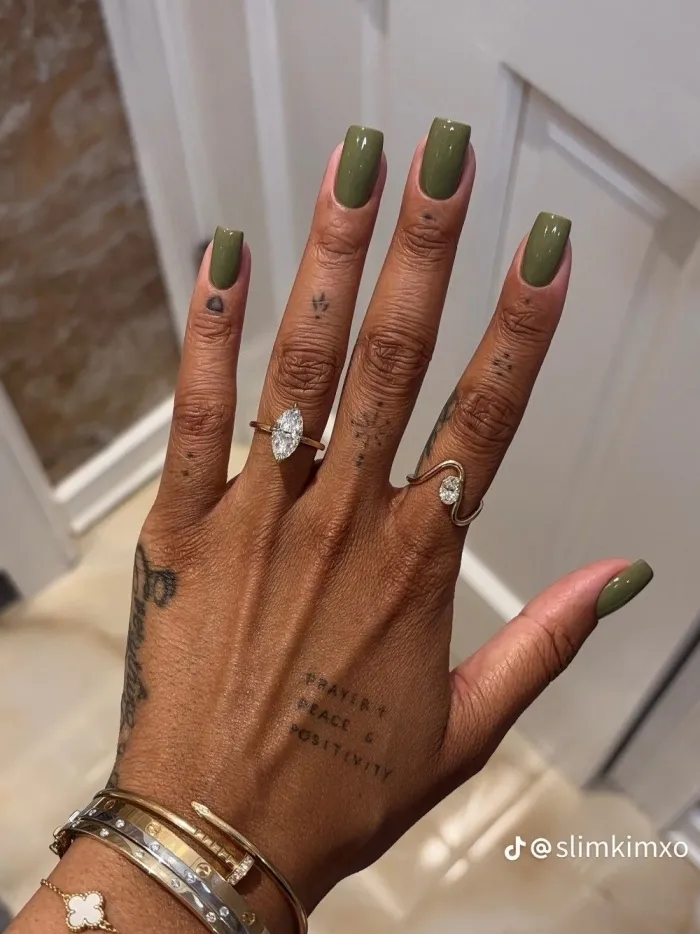
Further from jewel tone than emerald, closer to earth tone, sitting nearer khaki than forest.
It wasn’t getting requested as a fall nail color a decade ago, and now it shows up constantly this time of year.
One thing though. On really warm, golden undertones it can occasionally look a little murky instead of rich, especially in low light.
Weirdly, a matte topcoat fixes that better than gloss does. It also plays nicer with warm metallics, gold or bronze, than it does with silver.
RECREATE THE LOOK
If you liked this, you’ll love this post too:
35+ Ugg Slippers Outfits That Are Actually Too Cute to Stay Home In
11. Wine brown
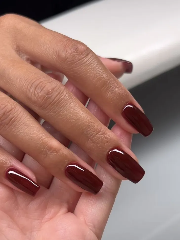
People keep assuming this is burgundy with a different name, and I have to correct them every time.
Wine brown leans brown first, red second, basically the reverse of what burgundy does. Reads more grounded, less dressed up.
On square or squoval shapes it looks close to a really good leather bag translated onto nails. Strange compliment, but I mean it as one.
High shine pulls out the depth here better than matte manages. Matte flattens exactly the part of this color worth wearing it for.
RECREATE THE LOOK
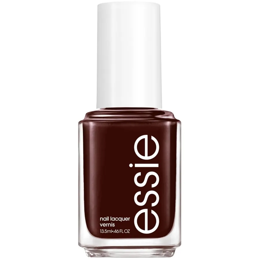
12. Navy
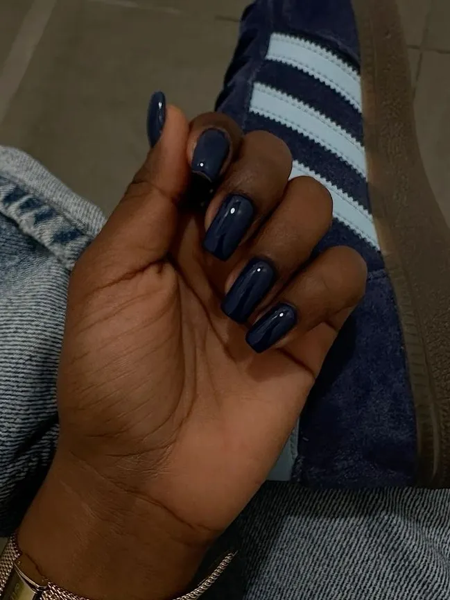
Here’s the thing about navy. If you’ve only seen it on lighter skin, it’s going to surprise you. Not cold, not flat, none of that.
Just skip anything shimmery. A solid, matte-leaning navy holds its own without needing sparkle to back it up.
Gold hardware next to it looks so sharp I’d almost call it a cheat code.
And it’s one of the only dark blues that doesn’t need a French tip or an accent nail to feel finished. It holds up fine on its own.
RECREATE THE LOOK
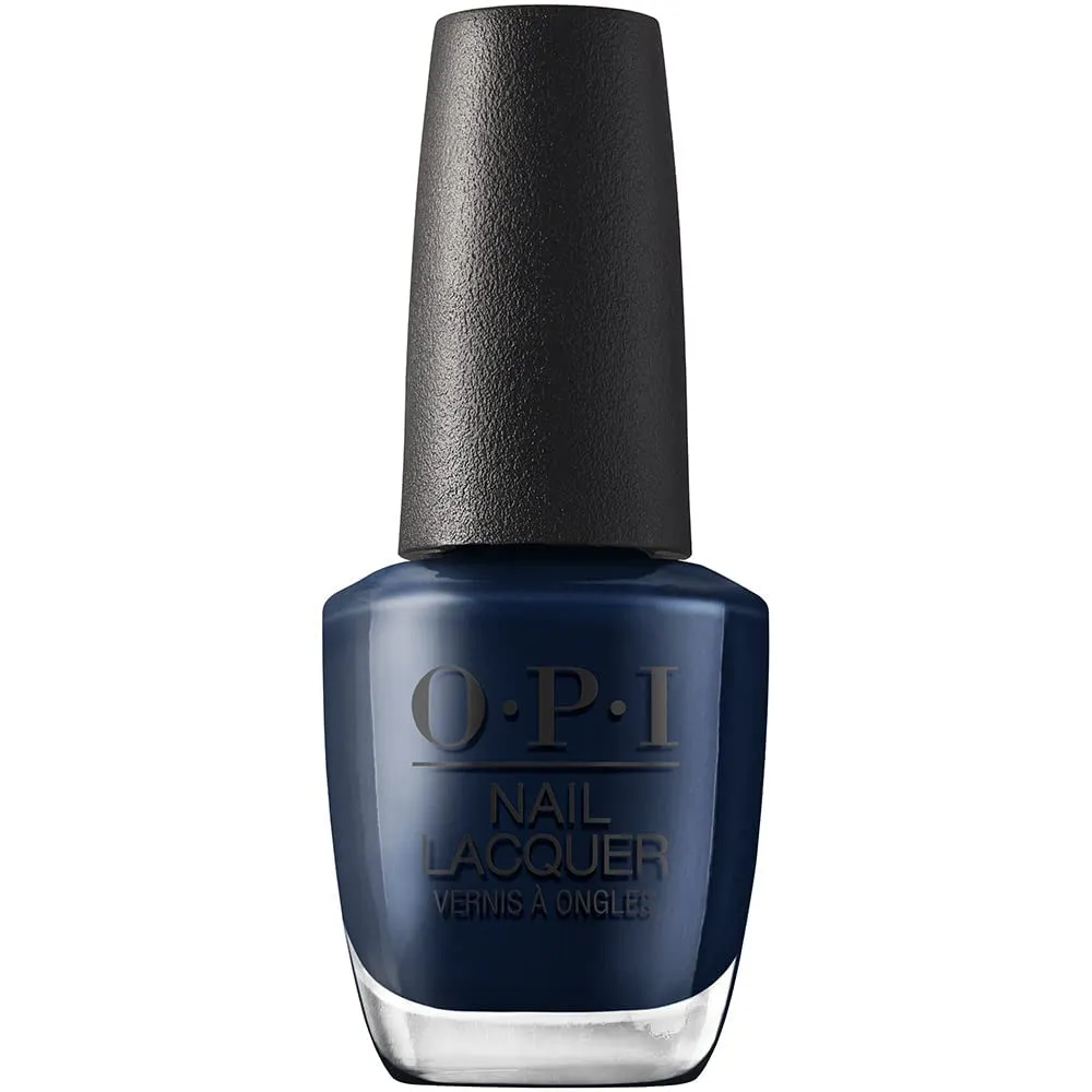
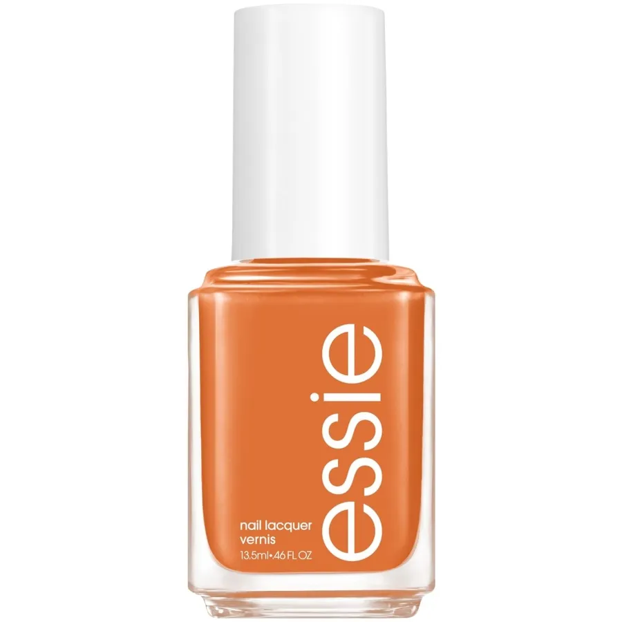
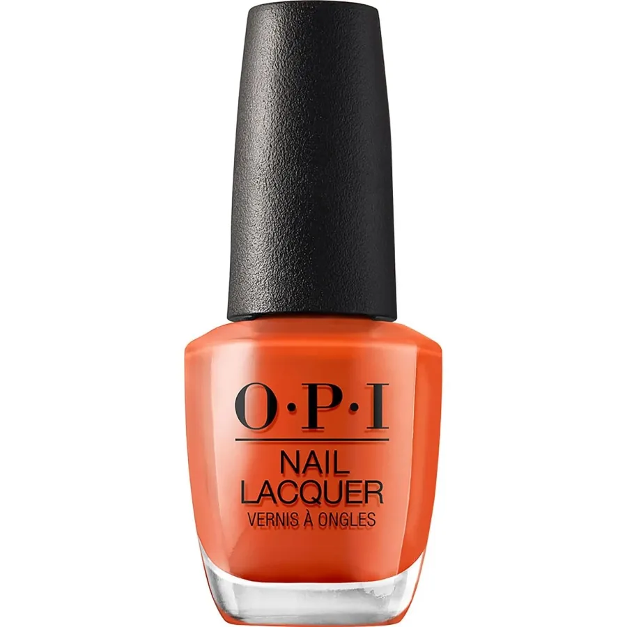
13. Pumpkin orange
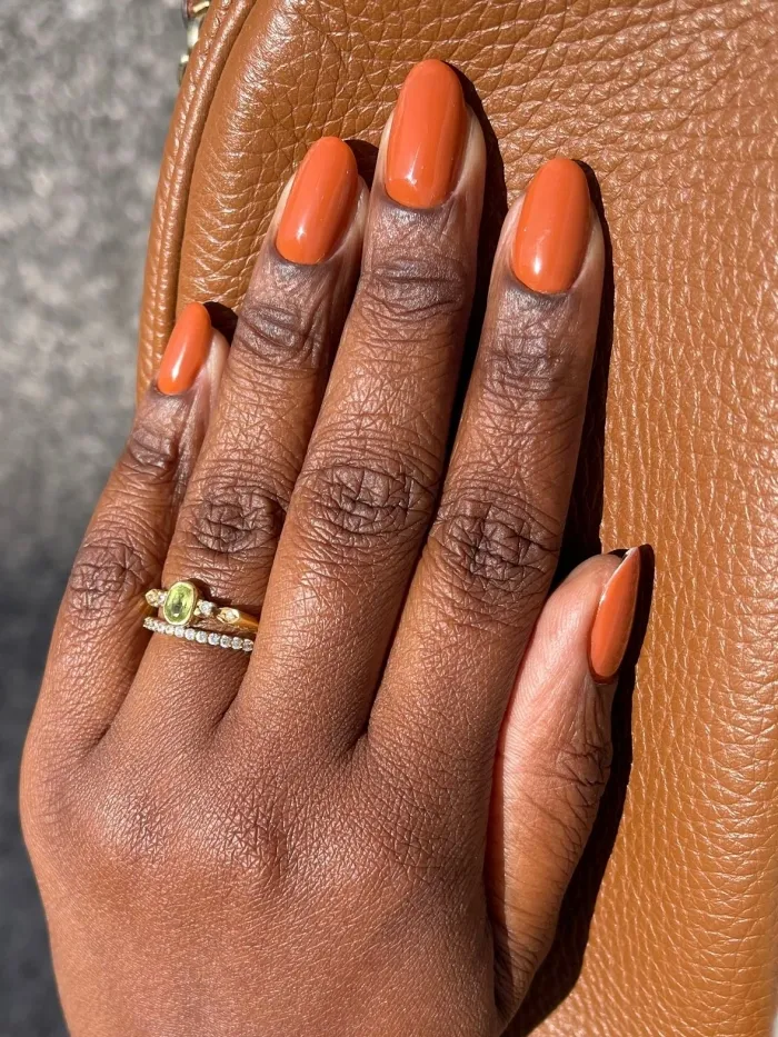
If you want the loudest color in this whole roundup, here it is. Saturated, unmistakable, the kind of shade that announces the season the second it’s on your hands.
I wouldn’t call this one subtle, and honestly it isn’t trying to be. Some colors here are meant to blend into a fall wardrobe quietly. This one’s meant to be the whole outfit.
Cream finish, no shimmer. Anything glittery mutes the punch this color is supposed to have.
RECREATE THE LOOK
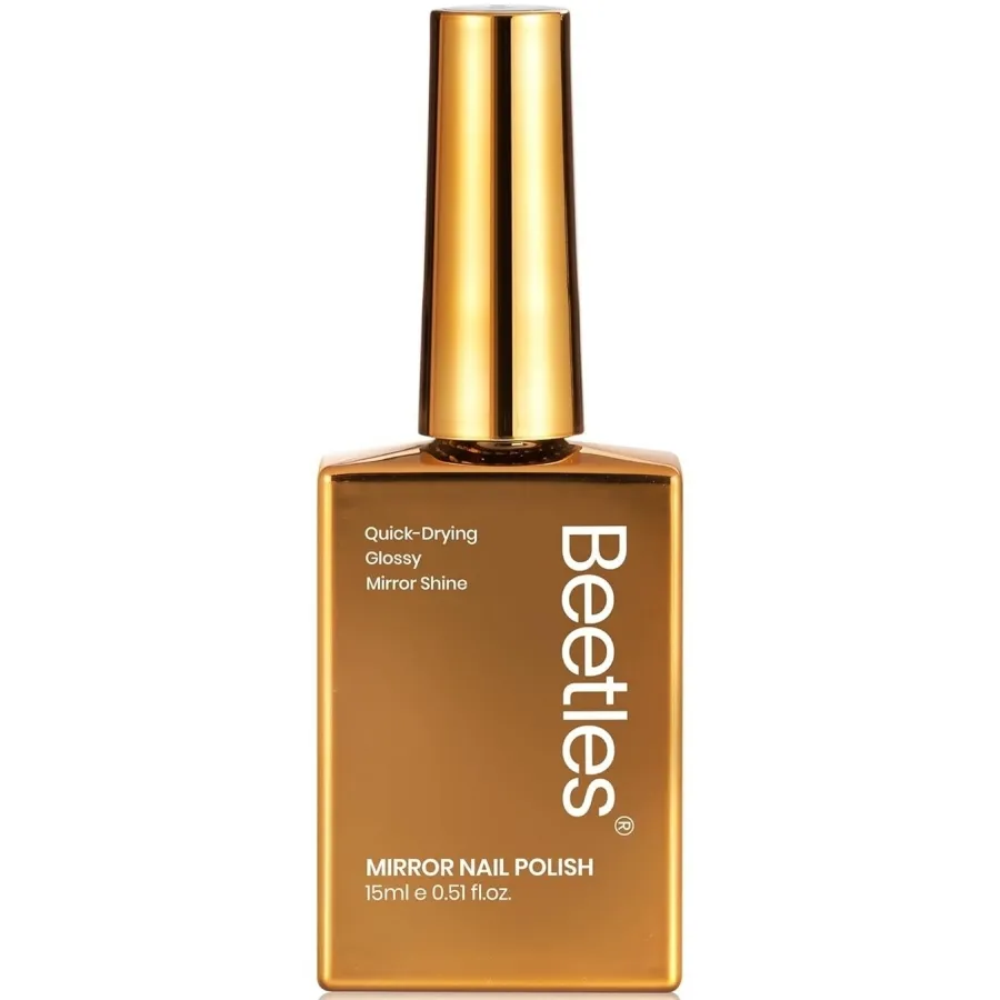
14. Metallic gold
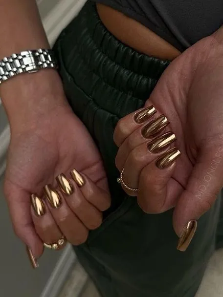
Gold does something different on deep skin tones than it does anywhere else. It catches the warmth that’s already there instead of sitting on top like foil.
People tend to treat this like an everyday color, and it really isn’t one.
Think night-out or holiday-party shade, something that photographs beautifully under warm lighting but can veer a little costume-y under harsh fluorescents.
Solid metallic only, no glitter chunks, no color-shifting finish underneath.
And if your nails run short, full coverage can look heavy, so doing it as a single accent nail instead of all ten is the smarter move.
RECREATE THE LOOK
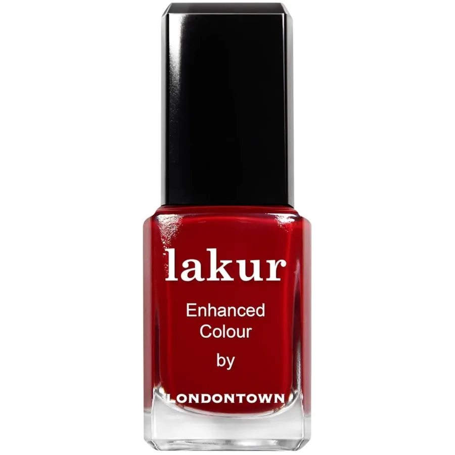
15. Deep red
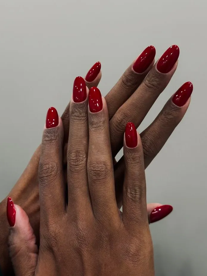
Here’s a color I don’t think gets enough credit. Not quite bright red, not quite oxblood, deep red sits in that narrow middle zone, still clearly red, only heavier than the brighter version.
I’d point someone here if bright red felt too loud and burgundy felt too dark. Splits the difference without feeling like a downgrade from either.
Glossy suits it well. So does a shorter nail, since the color carries enough presence without needing length to back it up.
RECREATE THE LOOK
16. Blackened plum
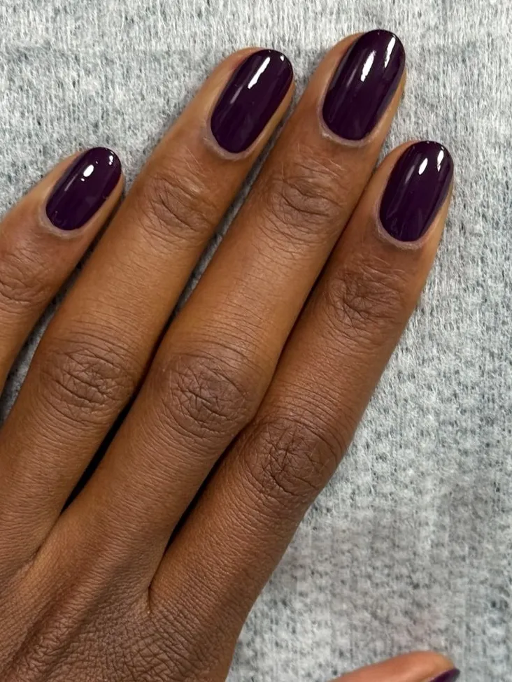
Burgundy’s moodier cousin, basically, and the more fun one to wear, if you ask me.
It shifts depending on the light. Purple in shade, nearly black under direct sun, instead of sitting there flat like a lot of dark polishes tend to do.
It photographs weirdly well because of that shift, too.
If you’re into stiletto or coffin shapes, that tonal movement catches the light differently across a longer nail than it would on something short and round.
RECREATE THE LOOK
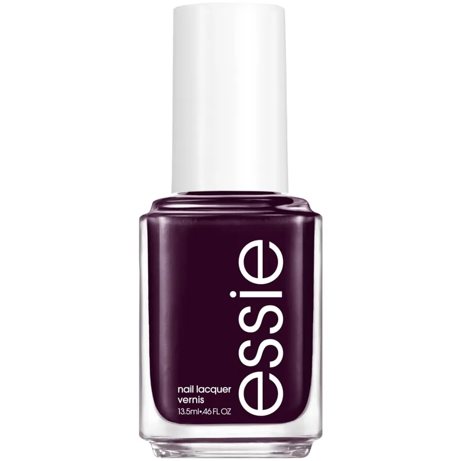
17. Taupe brown
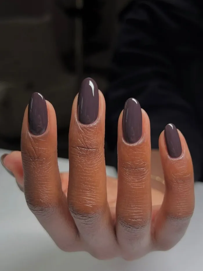
This one’s the sleeper hit. Taupe brown sits between gray and brown, refusing to fully commit to either, and it holds up on deep skin tones way better than that description makes it sound.
Save this one for weeks you want your hands looking put-together without anyone quite clocking why. It doesn’t call attention to itself, which is sort of the point.
Soft gloss, almond or oval. Low effort, high payoff.
RECREATE THE LOOK
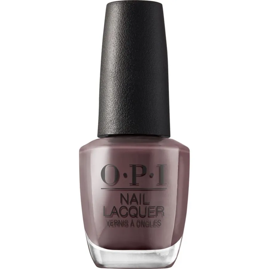
18. Emerald green
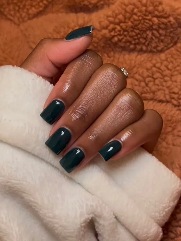
I recommend emerald more than I probably should, but it earns it. It doesn’t behave like a trend color, which is why it never goes out of style the way other greens do.
Short square nails make it look clean, almost architectural. Longer almond shapes push it more decorative.
Either way, throw some gold rings on next to it and suddenly the whole hand looks less like a manicure and more like actual jewelry.
RECREATE THE LOOK
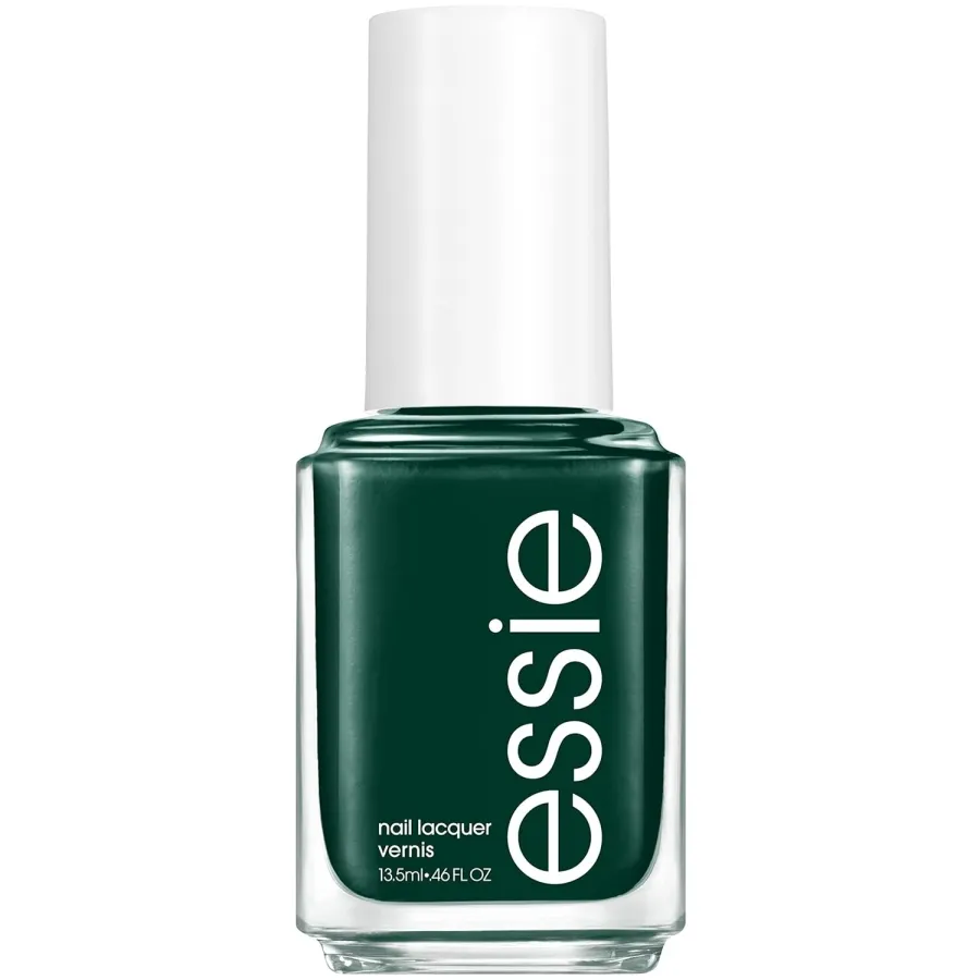
19. Burnt orange
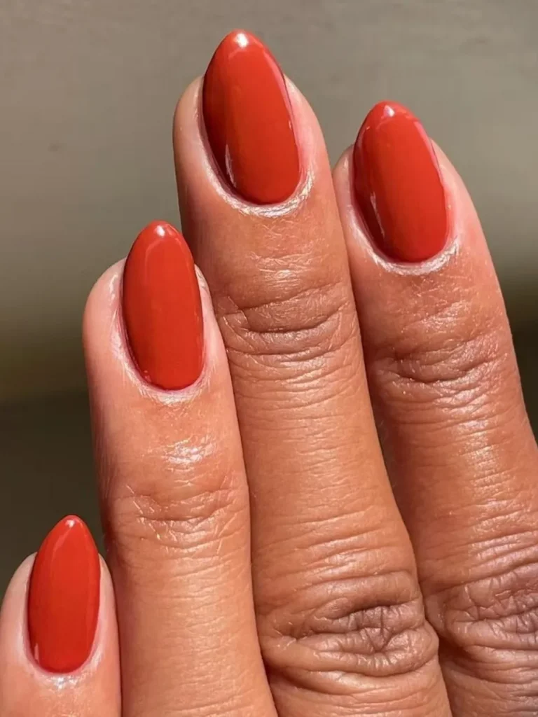
Somebody decided burnt orange is a summer nail color and I genuinely don’t understand it.
Rust, warmth, everything about this shade says fall, not July. Quieter than pumpkin orange, but it’s earning that quiet.
On darker skin it barely even reads as bold. More like an extension of an undertone that was already there.
Two coats gets you close to fully opaque. One coat gives you this sheer, washed terracotta wash that some people actually like better.
Stick with a cream finish here. Anything shimmery or glittery tends to look dustier than intended instead of warmer.
RECREATE THE LOOK
20. Black
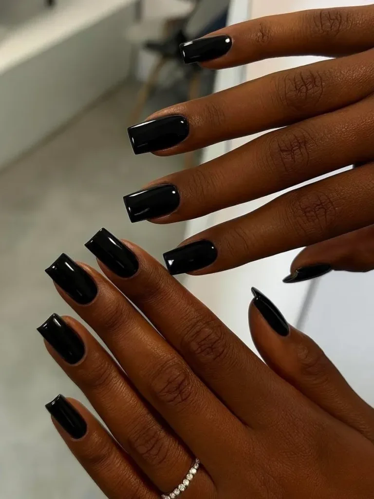
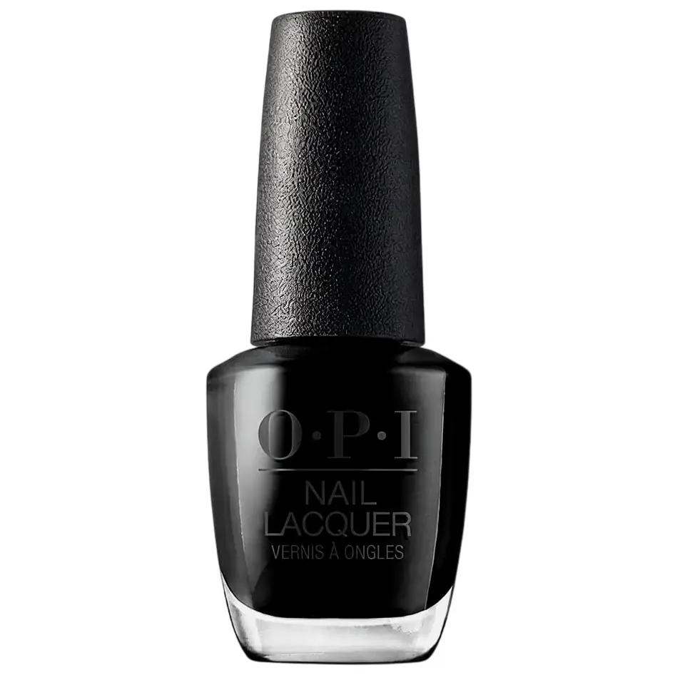
People worry black as a nail color is going to disappear on deeper skin. It’s actually the opposite. It sharpens the whole hand instead of fading into it.
Where people mess it up: going too thick. It pools right at the cuticle and ends up looking sloppy instead of sharp. Thin, even coats matter more here than with almost any other color in this roundup.
Square or almond, glossy topcoat, done.
Matte black looks dustier and less sharp in photos than the glossy version does, even though matte’s having a moment in salons right now. I’d still pick gloss every time.
RECREATE THE LOOK
More posts you’ll love
Twenty shades is a lot, I know. If you only pick one from this list, make it dark chocolate.
It won’t be the one people stop you to ask about. It’ll be the one you still reach for in March, long after the others have had their moment.
The rest will still be here when you’re ready.