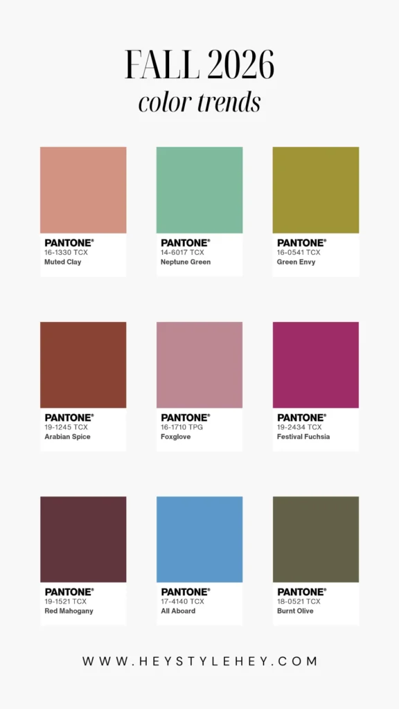
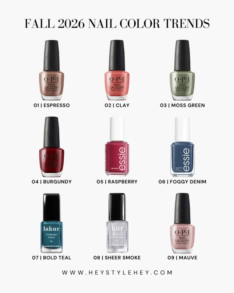
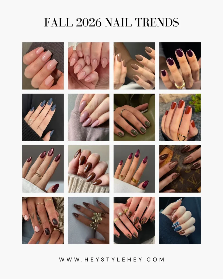
I had like six tabs open this week trying to make sense of fall 2026 color trends — Pantone’s report, a few runway recaps, what a couple buying teams said they’re stocking.
Brown and green everywhere, and then this hot pink sitting right in the middle of the whole color palette with no explanation for why it’s there.
Ten main colors. Five neutrals to go under them.
Not all ten are for everyone, and I’ll say so as we go instead of pretending every single shade works on every single person.
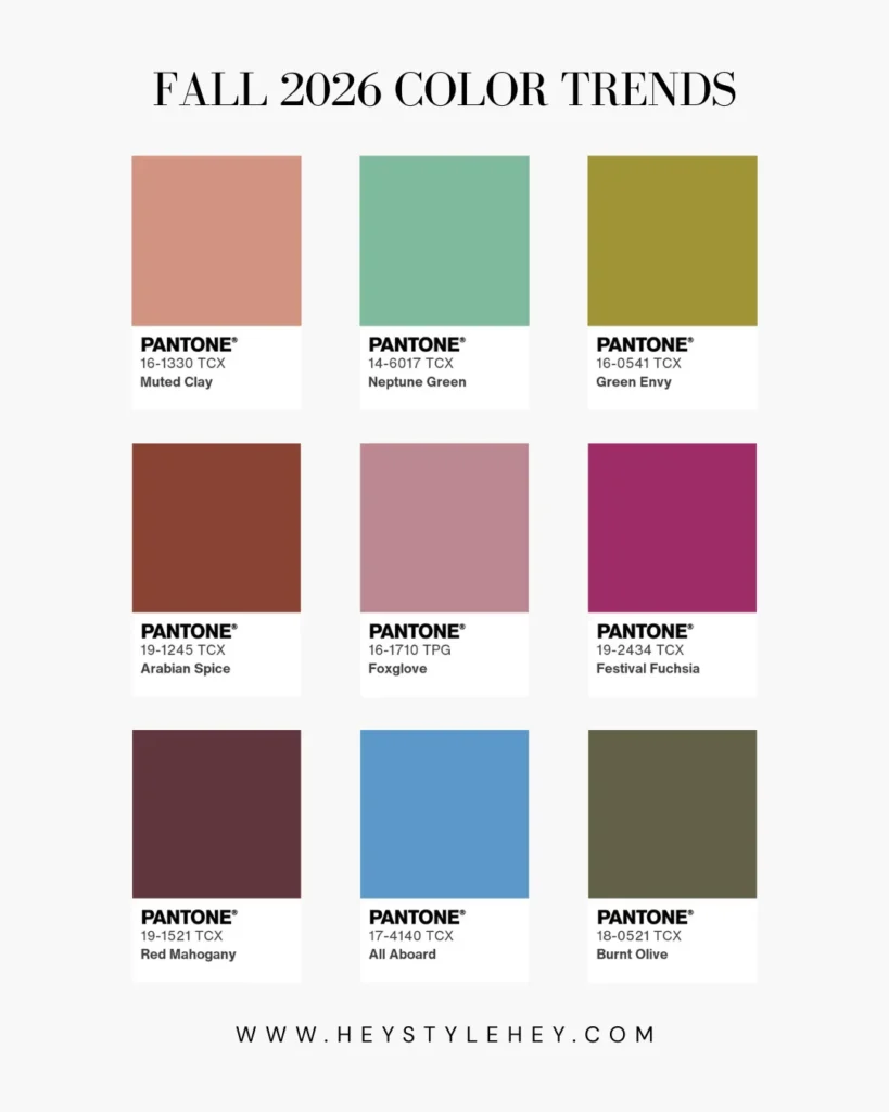
So What’s the Vibe This Season
Earthy stuff is back — Muted Clay, Burnt Olive, that whole grounded thing you’ve probably seen creeping back into your feed for a few weeks now.
And then Festival Fuchsia just shows up, no warning, completely unrelated to anything else in the room. That’s basically what’s trending this fall in one sentence — comfort and chaos sharing a rack.
Every report I read called this a “duality,” and I rolled my eyes the first time I saw the word. Felt like something someone made up for a slide deck.
But then I started looking at the swatches side by side and, fine, brown one day and electric blue the next does kind of work.
If you’ve had earthy pieces sitting in your closet for two years now, waiting for them to be cool again — yeah, go dig them out.
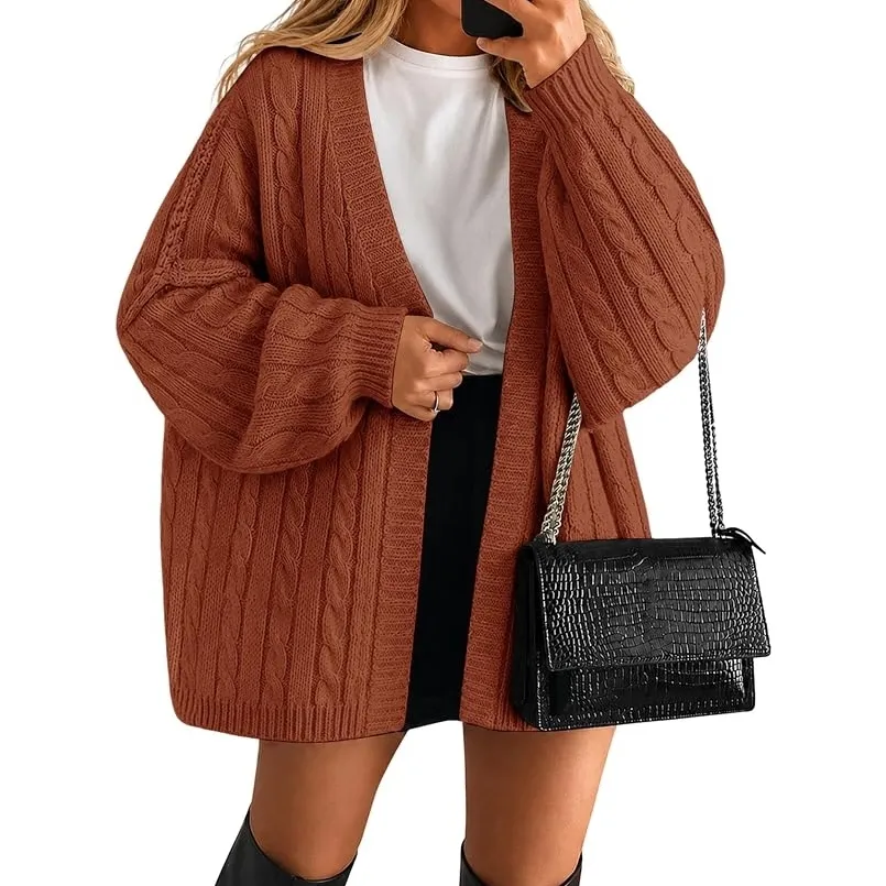
1. Muted Clay — This Fall’s Go-To Terracotta
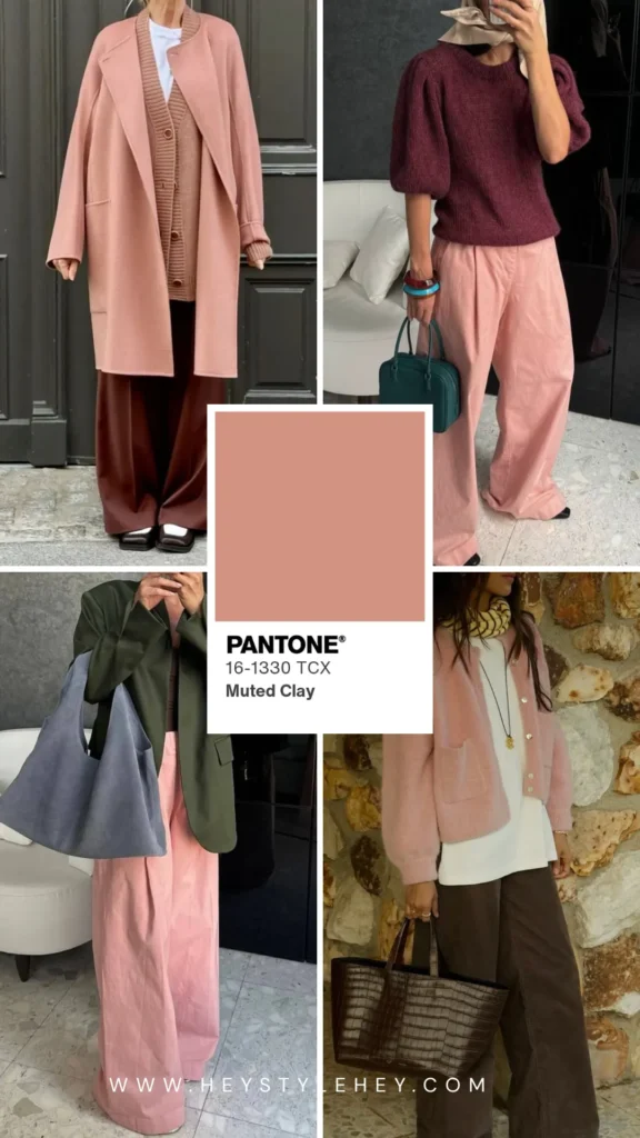
This is the one I’d buy first if I were only getting one new thing this season. Softer than the harvest-orange terracotta you’d expect when you hear that word. Dustier.
Like it’s been left out in the sun a little too long and faded into something quieter. Pantone called it rustic and enduring, and yeah, that’s about right for once.
A sweater in this barely even registers as wearing color. It just looks like a neutral that happened to be warm.
How to wear it: Toffee underneath, or black denim if you want some contrast, or just on its own as your neutral for the day. No need to overthink it.
Shop the Trend

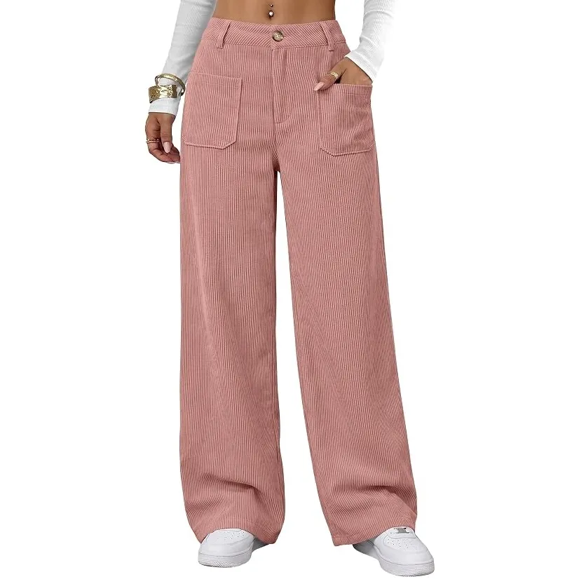
2. Neptune Green — The Aquatic Throwback Nobody Asked For
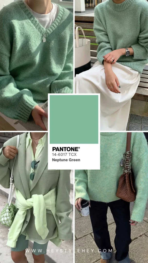
Pantone’s team flagged this as one of the bigger surprises in their own report, which I get, because a retro aquatic green in a fall lineup isn’t exactly what you’d expect.
My first thought looking at the swatch was that it felt more like spring than fall. Then I saw it on a coat over deep brown and changed my mind pretty fast.
How to wear it: layered as outerwear, over Arabian Spice if you’ve got it in your closet already. The contrast does most of the work, so you don’t need to think too hard about what goes underneath.
Shop the Trend
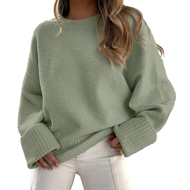
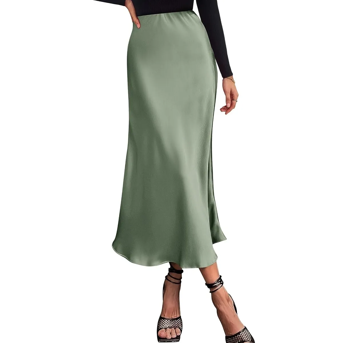
3. Green Envy — Sage’s Edgier Cousin
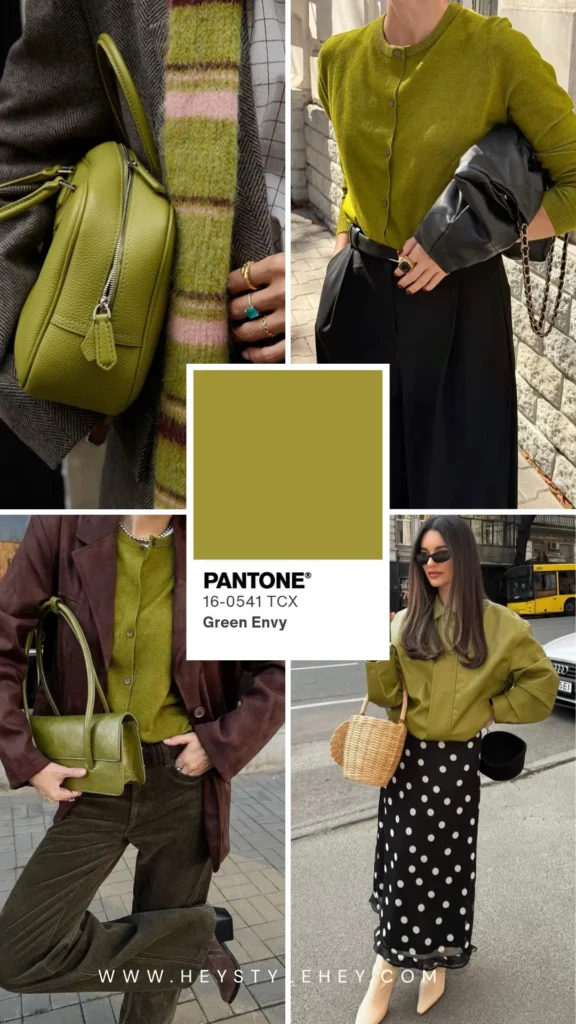
This one’s going to sell out and nobody’s even going to clock it as a new trend, because it’s close enough to the sage everyone already owns that there’s nothing to talk yourself into.
How to wear it: sweater, denim, white or Egret-toned sneakers. That’s the whole outfit. Stop there.
Shop the Trend
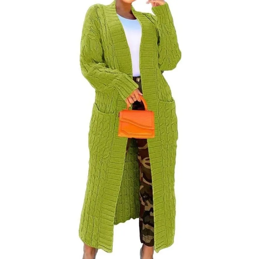
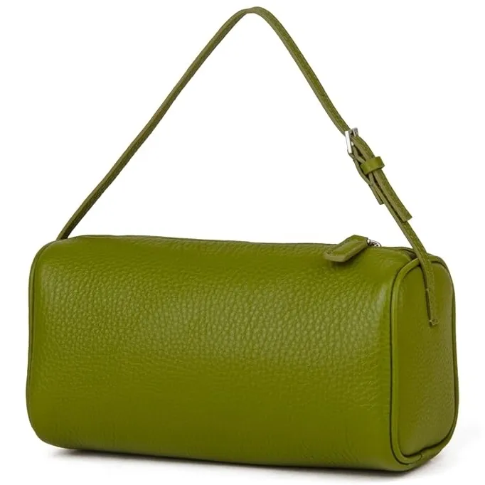
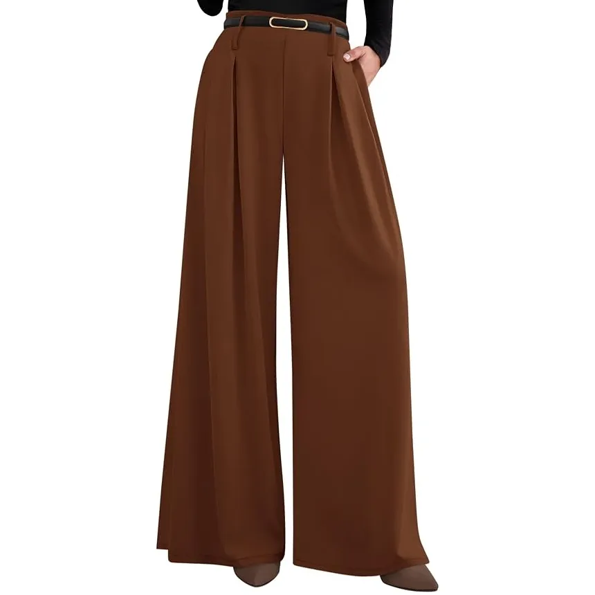
4. Arabian Spice — Brown, Finally Doing Something
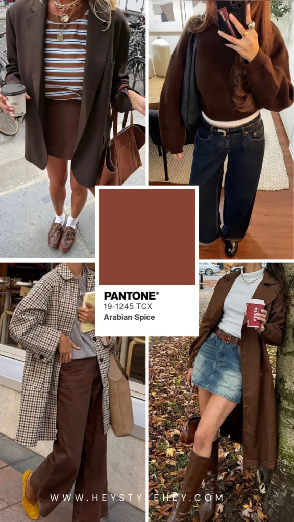
Brown’s been kind of the background player of fall for a couple years now, sitting there while other colors get the attention. This one’s got more going on.
Not cinnamon, not last year’s rust — there’s enough red in it that it doesn’t fade into beige the way some “brown” trend colors do once you put them on.
How to wear it: layer with Underworld grey, or keep it monochrome with Toffee accents if you want the whole look to feel a little more pulled together.
Shop the Trend
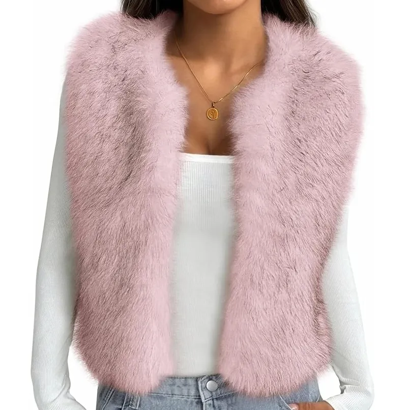
5. Foxglove — A Softer Way Into Pink
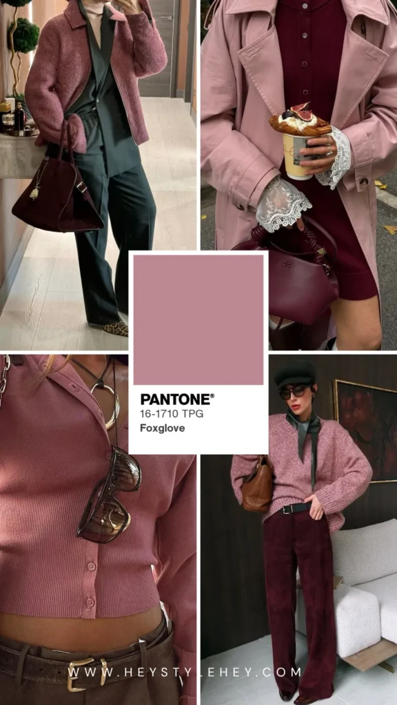
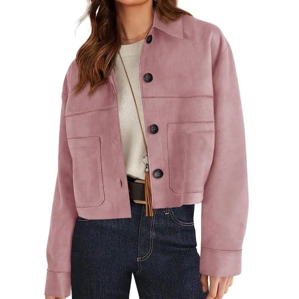
Took me a minute on this one. Mauve, soft, a little faded — like it had already been worn before you even bought it.
There’s an old-photograph quality to it that I wasn’t sold on right away. Alone on a swatch it looks flat.
Next to black it doesn’t. No idea why, but a lot of these colors do that — look kind of sad alone, then fine the second something dark shows up next to them.
If the fuchsia feels like too much of a leap, this is the gentler version of the same idea.
How to wear it: something dark with it — black, Underworld grey, or even just deep denim works fine.
It also works as a blush or lip if clothing feels like too much commitment. The muted tone keeps it from looking costume-y on your face the same way it can on a swatch.
Shop the Trend
6. Festival Fuchsia — The Color That Splits a Room
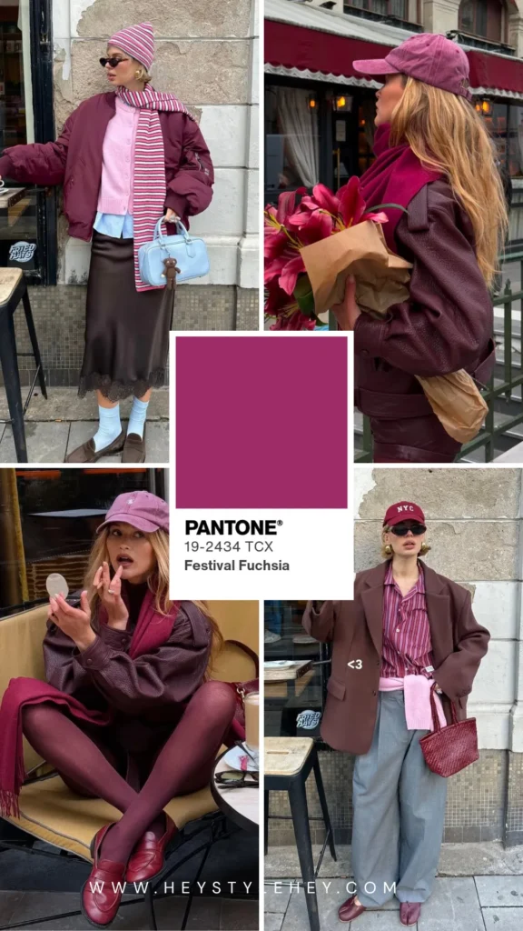
I tried this next to Burnt Olive on a bored afternoon when I had nothing better to do, and it worked better than I expected.
The olive just kind of grounds the whole thing. Doesn’t feel like a costume anymore, it just feels like an outfit somebody put together on purpose.
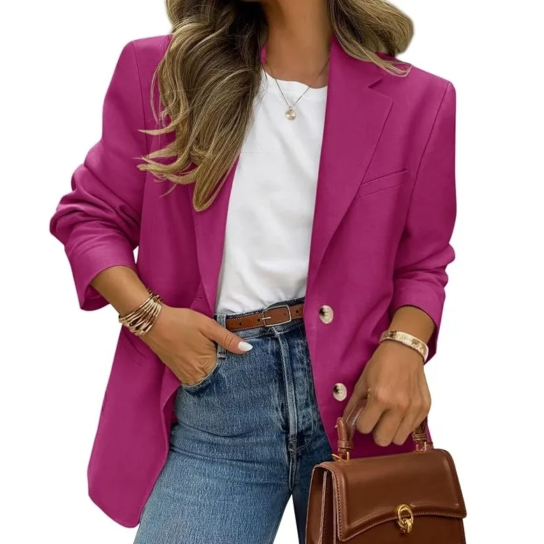
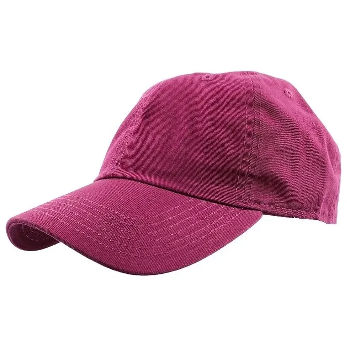
This is the loud one, obviously. “Carnival spirit” is the line Pantone used and it’s not wrong — bright, a little chaotic, no interest in blending in with anything around it.
People either grab it immediately or scroll right past the swatch like it personally offended them. Most of the runway photos go full head-to-toe, which doesn’t help — makes it look like more of a costume than it has to be.
How to wear it: small doses. A scarf, a bag, your nails if you want to test it without spending real money on a whole garment.
Nails might be the easiest entry point here — a full set in this is loud enough to scratch the itch without committing to wearing it on your actual body.
Shop the Trend
If you liked this, you’ll love this post too:
Fall 2026 Fashion Trends: What’s Actually Worth Wearing This Season
7. Red Mahogany — Burgundy’s Next Move
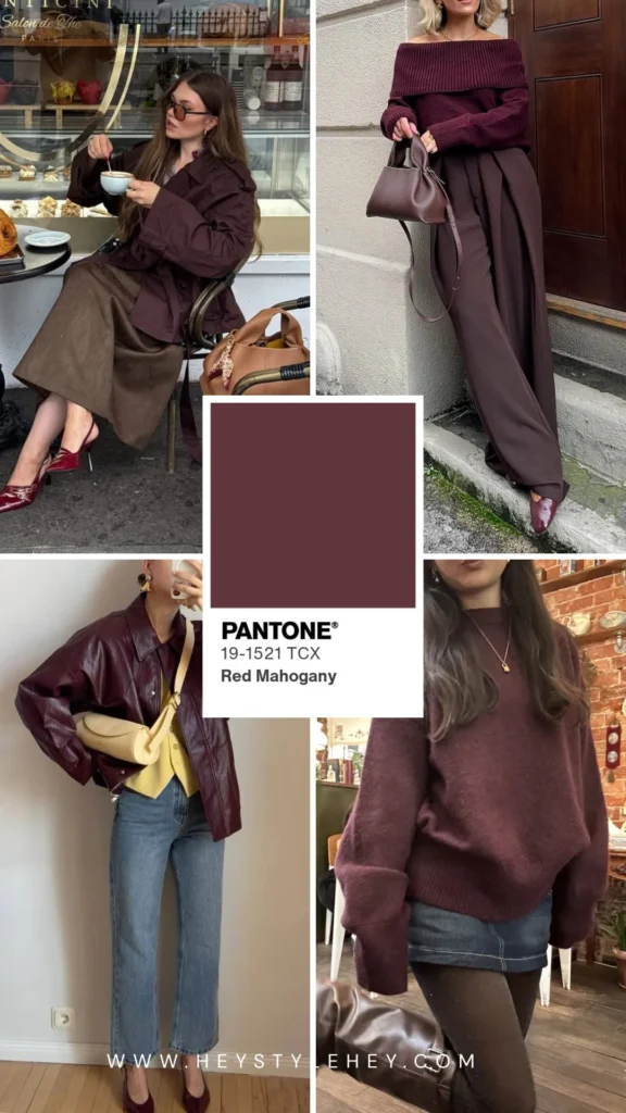
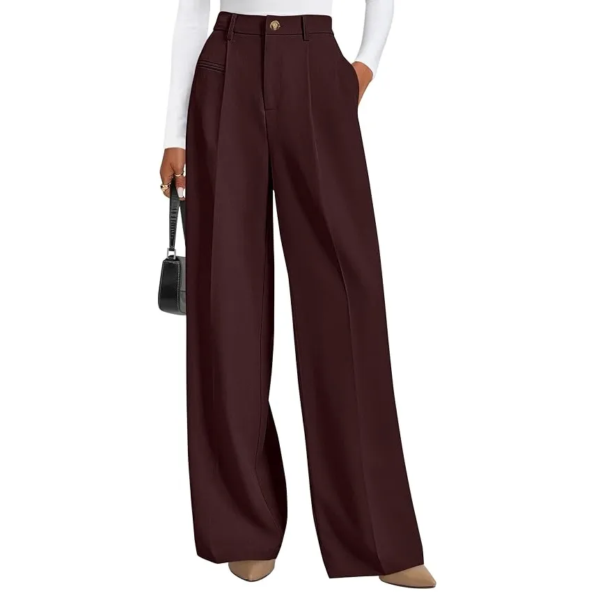
Burgundy’s had three seasons in a row now and I’m just over it. This is the brown-leaning version of the same color — still wine-dark, still moody, just shifted enough that it doesn’t feel like the exact same thing you already own.
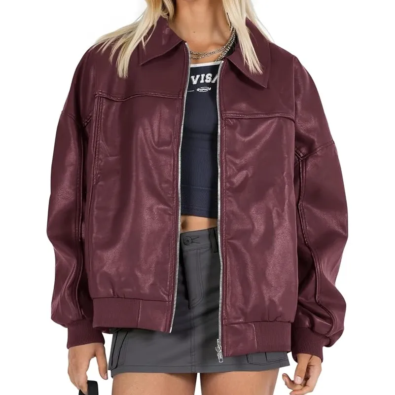
Leather jacket. Boots. You already know what I’m picturing here.
How to wear it: Candied Ginger if you want it warmer, Underworld grey if you want it to feel sharper and more serious.
Shop the Trend
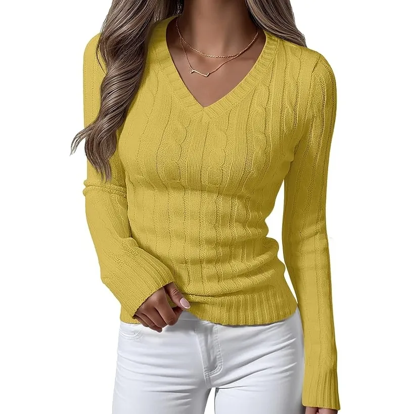
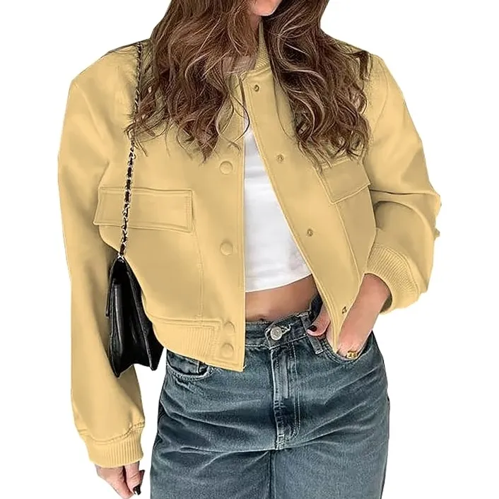
8. Acacia — The Yellow I Can’t Quite Describe
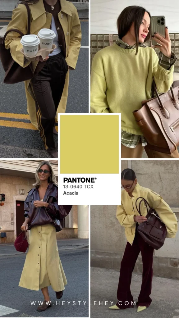
Yellow with green running underneath it, which keeps it away from buttery or mustard-y territory.
I’ve tried describing this color to people in person more than once and I just can’t do better than “yellow, but not in the way you’re picturing.”
It photographs almost neon, but in person it’s softer than that — less traffic-cone, more like something you’d see on a real plant.
Most yellows this saturated end up looking either childish or like a safety vest. This one just doesn’t. No idea why, maybe the green underneath it.
How to wear it: one piece only, at least at first — a sweater, a bag, or just your nails if you’re easing in slowly.
That’s usually my move with the louder colors, and there’s no shame in starting small. A single Acacia nail, even just an accent on one finger, gives you the whole effect without the yellow-vest risk.
Shop the Trend
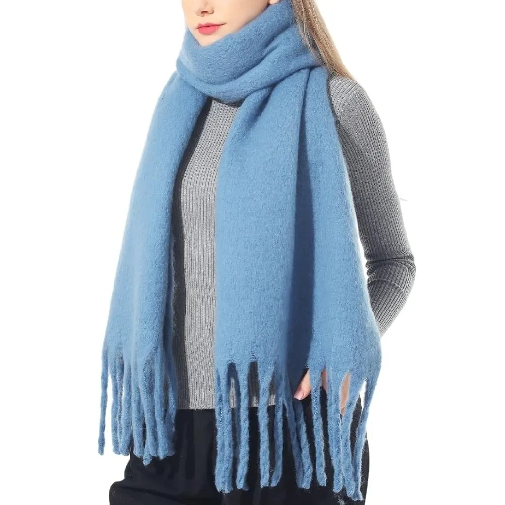
9. All Aboard — The One Real Blue
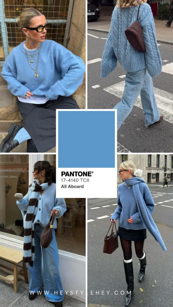
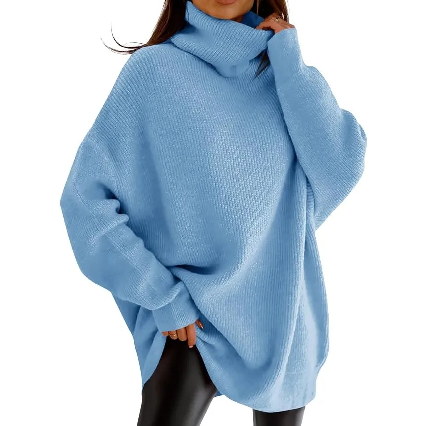
The one real blue in this whole lineup, and probably my favorite of the ten.
Net-a-Porter’s buying team called saturated color one of the season’s biggest stories, and this is pretty much what that looks like once it’s off a runway and onto an actual person.
You put it on next to all the brown and green and it just looks different, in a good way, kind of like someone cracked a window.
Doesn’t clash with brown either, weirdly. Just put it next to a brown coat and it works.
How to wear it: Egret or Toffee underneath, and that’s really all it needs.
Shop the Trend
10. Burnt Olive — The Safest Bet of the Bunch
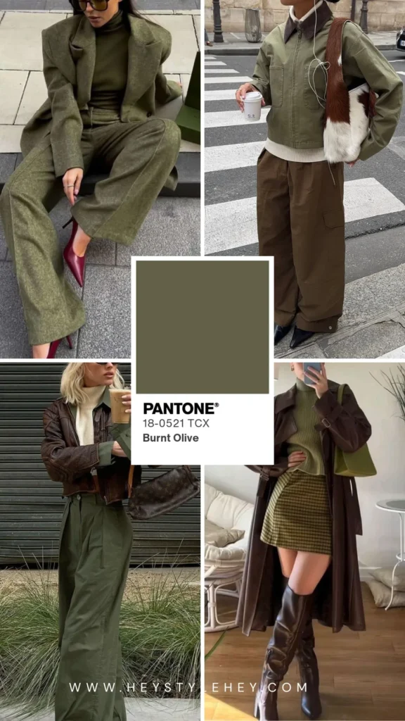
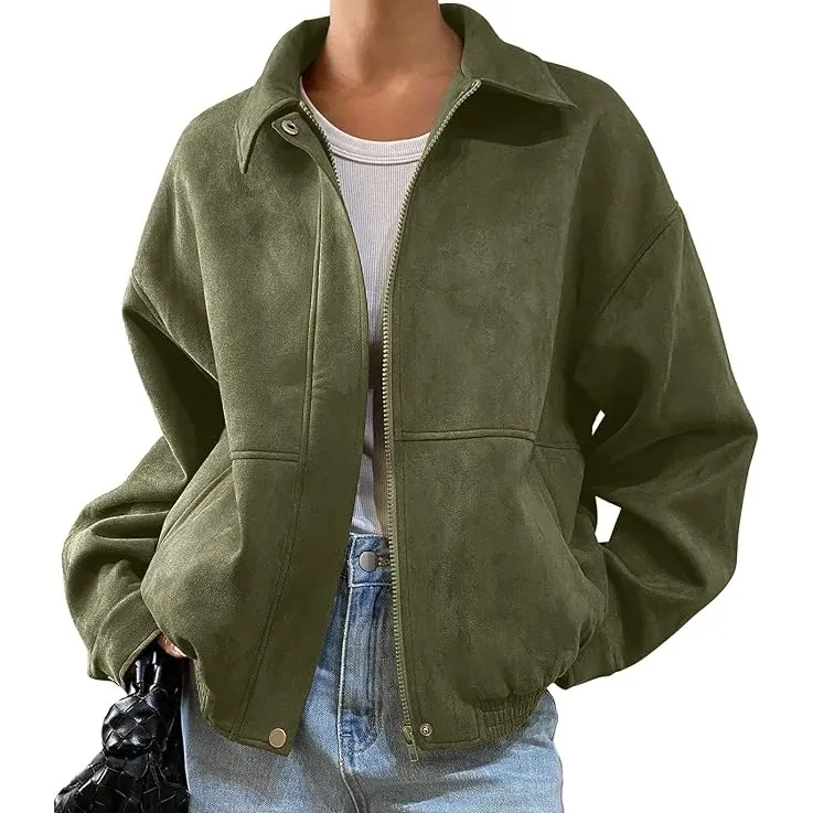
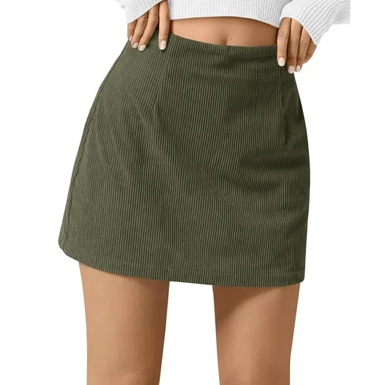
Already feels like a neutral, which is rare for something this new. Goes almost black under bad lighting, full green in the sun. Depends a lot on what room you’re in when you check the mirror.
If you’re buying exactly one new color this fall, make it this one.
How to wear it: with literally anything else here — Festival Fuchsia, Arabian Spice, even a plain white tee. Never looks wrong.
Shop the Trend
The Neutrals Holding Everything Together
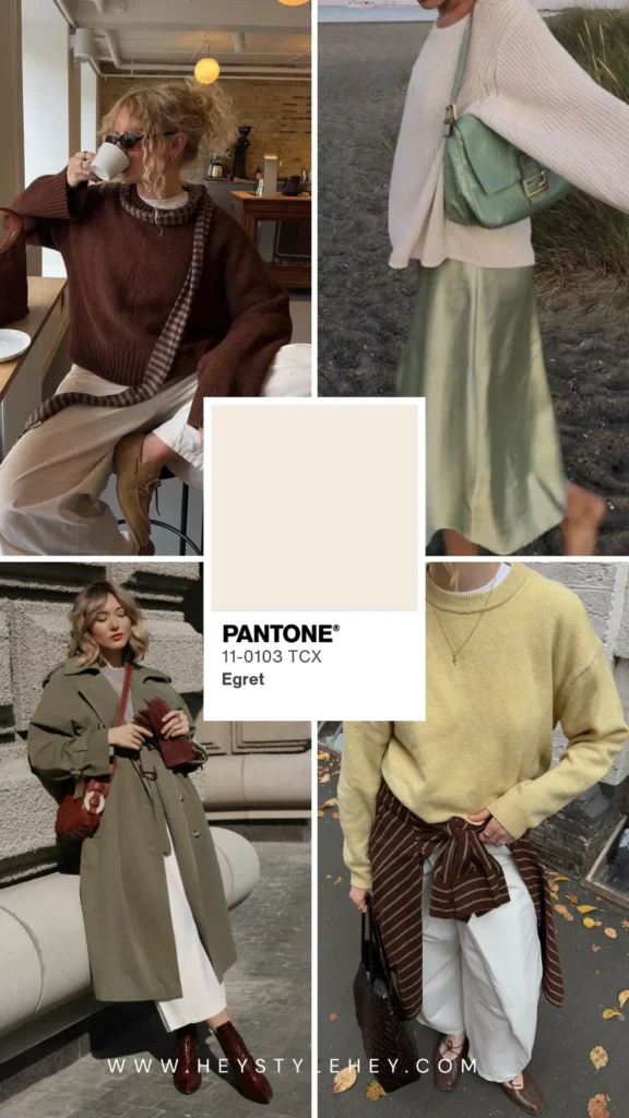
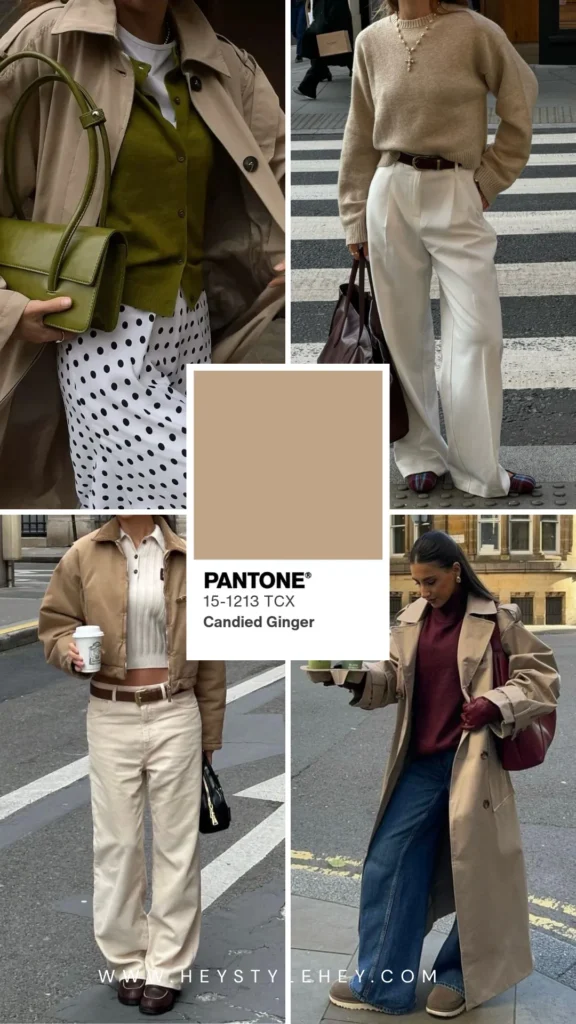
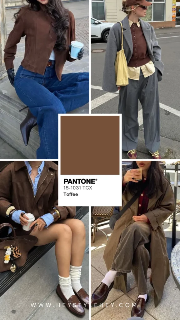
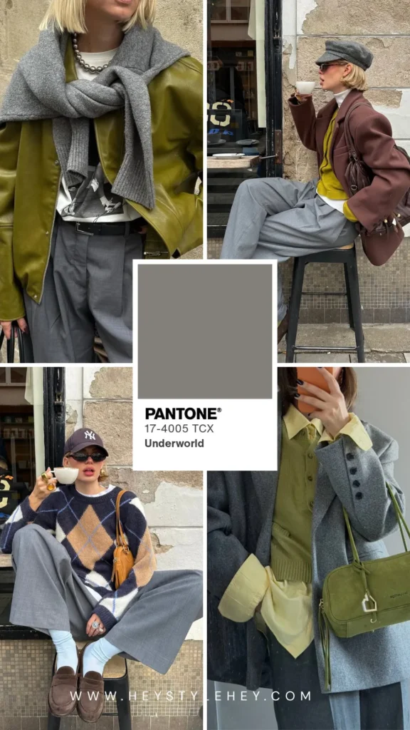
None of these ten colors really work on their own, and that’s the whole point of the five neutrals sitting underneath them — Egret, Candied Ginger, Toffee, Underworld, Poseidon.
- Egret’s a warm white, never stark.
- Then Candied Ginger — steady beige, just sits there quietly doing its job, doesn’t try to compete with anything.
- Toffee’s the deep brown, and this one’s holding most of the palette together whether you clock it or not.
- Underworld, the grey, works with all ten of the bold colors, which I didn’t expect from a grey this plain-looking.
- And Poseidon’s a deep blue, moodier than navy. Put it next to anything brighter and it just behaves itself, acts like a neutral the whole time.
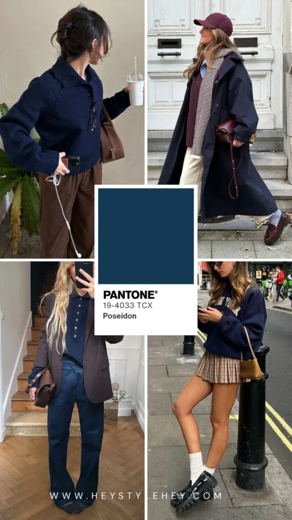
Start with these five if ten new colors feels like too much all at once. It usually is.
More posts you’ll love
That’s where I’ve landed on fall 2026 color trends for now.
More on what’s wearable this fall beyond just color over in my Fall 2026 Fashion Trends post if you want the bigger picture.